
Application Redesign

Overview
🧙♀️ My role: UX Researcher & Designer
🗓️ Timeline: June - November, 2023
Challenge
Users experienced design inconsistencies, unclear navigation, and unnecessary friction that undermined trust and increased completion time.
Solution
I created a standardized template system that maintained consistency across all post-application pages while adapting to multiple user journeys.
Key features
-
Context-specific header icons for each step
-
Standardized call-to-action system
-
Flexible template for alternative qualification paths
Impact
Quantitative Impact
-
1.5% increase in company issuance
-
15-minute reduction in completion time
Qualitative Improvements
-
Consistent brand experience throughout the process
-
Clear user guidance at each step
-
Reduced cognitive load through standardized layouts
-
Comprehensive error handling for better user recovery
1. Problem Discovery
Why isn't the current design working?
-
Design inconsistency across the post-qualified flow
-
Inconsistent color palettes
-
Varying call-to-action styles
-
Inconsistent user feedback mechanisms
-
Lack of clear user direction
-
Unnecessary clicks creating friction
These design inconsistencies created a fragmented and confusing user experience that eroded user trust and complicated what should be a straightforward process. By introducing unnecessary complexity and cognitive load, the existing design risked increasing user drop-off and potentially deterring qualified applicants from completing their loan application.
Examples of a few different screens before my redesign

.png)
2. Goals & Strategy
Project Goals
-
Create consistency across post-application pages to build brand trust
-
Reduce friction through thoughtful color usage and focused content areas
-
Provide clear instructions throughout the application process
-
Increase user engagement and conversion rates
Instead of just updating the UI to fit the most recent design system, I looked for opportunities within the flow to improve the user experience and drive business initiatives.
3. Design Process
Template First Approach
I developed a reusable template system to ensure consistency and implement UX best practices across all pages.
-
Context-Specific header Icons
-
Unique icons for each application step
-
Visual reinforcement of current process stage
-
-
Clear Information Architecture
-
Descriptive page titles
-
Action-oriented content structure
-
Clear instructional copy
-
-
Dynamic Content Areas
-
Flexible content sections
-
Consistent layout structure
-
Focused information presentation
-
-
Standardized Call-to-Action System
-
Clear primary actions
-
Well-defined secondary options
-
Consistent button styling and placement
-
1
2
3
4

Template Implementation
When implementing the template, there were some pages that translated easily and some that required some extra consideration.
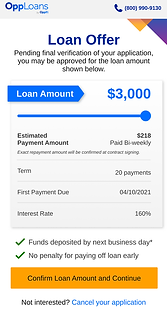
Example #1: Qualified Page
The purpose of this page is to communicate to the user that they have passed the preliminary checks and are qualified to continue with their approval process.
At this point in the flow, we know if they are eligible to be fast tracked and the estimated dollar amount they may receive. For users who are not fast tracked, the next step is to connect their bank account, which is the highest drop off point. Therefore, this is a crucial point in the flow, and it's imperative that the user is encouraged to continue.
Current Design
For such a crucial page in the flow, this page is found lacking:
-
The dark background does not match the design system
-
Ambiguous call to action
-
No excitement/incentive for the user to continue
-
Same design for users who are fast tracked
Before

My Design
While converting this page to the template I looked for other opportunities to drive conversion:
-
Friendly and encouraging tone throughout the page
-
Prominent loan amount
-
Button label tells the user where they are going next
-
Separate design for users who are fast tracked to communicate their approval
After

Qualified

Fast Tracked
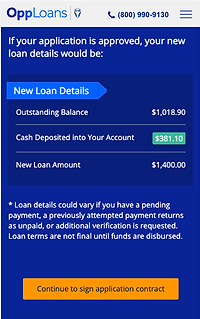
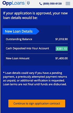
Example #2: Refinance Loan Offer Page
When a user applies for a refinance, it is essentially a top off on their current loan. The amount they qualify for is subtracted from the amount they still owe on their active loan, and that is what get's deposited in their account.
This page was a cause of customer confusion as seen in complaints, the call center, and when observing session replays. Users were unsure of the amount of cash deposited vs the qualified refinance amount. When looking at the current refinance offer design, it's not hard to see how this design is failing users.
Current Design
-
Unclear how the refinance calculation is done
-
Easy to miss the amount of cash deposited
-
Page had not been redesigned since it's creation and was missing key elements
Before
.png)
My Design
-
Transparency around how the refinance calculation
-
Cash deposited is most prominent element
-
Introduced other vital loan details such as term, first payment due, interest rate, and repayment type
-
Added the ability to withdraw application
After

Sad Path Consideration
Throughout the design process, I made sure to consider not just the happy path, but also the sad path scenarios.
Sad Path Scenarios
-
Additional verification needed (Document Upload)
-
Returning user (Magic link login)
-
Bank account connection troubleshooting
-
Denied pages
Sad Path Template
To ensure consistency in the flow, I created a template for these alternative flows that could be stitched into the flow as needed. This template would follow the architecture of the previous template, but visually stand out as a checkpoint for users.

-
Context-Specific header Icons
-
Unique icons for each application step
-
Visual reinforcement of current process stage
-
-
Clear Information Architecture
-
Descriptive page titles
-
Action-oriented content structure
-
Clear instructional copy
-
-
Dynamic Content Areas
-
Flexible content sections
-
Consistent layout structure
-
Focused information presentation
-
-
Standardized Call-to-Action System
-
Clear primary actions
-
Well-defined secondary options
-
Consistent button styling and placement
-
1
3
2
4
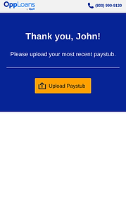
Sad Path Example: Additional Verification Needed
At certain points in the flow, it may be determined that we need additional verification to continue with the approval process. These scenarios require a document upload that may be used to verify the user's identity, bank account, income, etc.
My goal for this page is to create a single, dynamic document upload center and implement UX best practices.
Current Design
-
Instructions lost among other visual elements
-
Generic document upload section
-
No additional instructions for accepted document types/size
-
No visual cues for attached documents
Before

My Design
-
Dynamic document folders that trigger based on internal need
-
Tell user accepted document formats/size
-
Clear communication to user about how to proceed with approval process
-
When returning to this page users will be able to see previously uploaded documents
After

Example of dynamic folder

Document attached
4. Developer Handoff
⭐
As a one woman design team, it's important to me to stay close to all aspects of a project's journey. I endeavor to create collaboration between various areas of the business to create a smooth transition from designs to the finished product.
Responsive Design Approach
-
Created detailed designs for both mobile and desktop experiences, with priority given to mobile optimization (86% of users)
-
Provided responsive breakpoint specifications and behavior documentation
-
Ensured template components maintained design integrity across all screen sizes
Documentation & Assets
-
Created comprehensive design system documentation outlining component behavior
-
Provided annotated designs highlighting interactive elements and state changes
-
Developed a component library with reusable elements to ensure consistency
-
Included detailed specifications for animations and transitions
Stakeholder Collaboration
-
Presented final designs to cross-functional stakeholders including senior leadership, product, and engineering teams
-
Conducted walkthrough sessions explaining design rationale and user experience goals
-
Addressed technical feasibility questions and collaborated on implementation approaches
-
Aligned on success metrics and testing strategy
Implementation Support
-
Remained available throughout the development process for clarification and guidance
-
Participated in regular check-ins to review implementation progress
-
Provided feedback on development builds to ensure design fidelity
-
Collaborated with QA team to verify proper implementation of different user journeys
-
Created a feedback loop to document and address emerging technical challenges
Design-Development Partnership
-
Worked with developers to identify opportunities for component reusability
-
Collaborated on performance optimization without compromising user experience
-
Maintained open communication channels for real-time problem solving
-
Participated in code reviews from a UX perspective when appropriate
5. Results & Impact
A/B Test
Quantitative Impact
-
1.5% increase in company issuance
-
15-minute reduction in completion time
Qualitative Improvements
-
Consistent brand experience throughout the process
-
Clear user guidance at each step
-
Reduced cognitive load through standardized layouts
-
Comprehensive error handling for better user recovery
Lessons Learned
Template-First Design Benefits
-
Creating a consistent template system early in the process significantly reduced design time for subsequent pages
-
The standardized approach made it easier to onboard developers and ensure consistent implementation
-
Template flexibility proved essential for accommodating various user journeys while maintaining brand consistency
User Journey Complexity
-
The post-qualification process revealed more varied user paths than initially anticipated
-
Understanding these alternative journeys led to more inclusive design solutions
-
The importance of designing for all user scenarios, not just the ideal path
Metrics Impact
-
Small UX improvements can lead to significant business outcomes (1.5% increase in issuance)
-
Reducing completion time by 15 minutes demonstrated the value of streamlined user flows
-
The connection between design consistency and user trust became measurably evident
Future Opportunities
Continuous Optimization
-
Implement A/B testing for specific template elements to further optimize conversion
-
Gather more granular data on user behavior within each alternative journey
-
Regular review of drop-off points to identify additional improvement opportunities
System Scalability
-
Expand the template system to other parts of the application process
-
Create a comprehensive design system documentation for future team members
-
Develop reusable component libraries based on successful template elements
User Research Expansion
-
Conduct dedicated research on users who follow alternative qualification paths
-
Implement continuous feedback mechanisms for post-completion user experiences
-
Explore opportunities for personalization based on user segments
More Projects


Customer Portal Redesign
UX Designer - 2023
I redesigned our customer portal to streamline account management, creating an intuitive platform with user-controlled features and data visualization that empowers users to manage their financial journey more effectively.
🔍
+$1.54M in annualized recoveries during A/B test
🔍
-Decrease in customer servicing calls

.png)