
Improving Payments

Overview
🧙♀️ My role: UX Researcher & Designer
🗓️ Timeline: April 2023 - June, 2024
Challenge
High friction payment processes causing customer frustration and increased call volume
Solution
Four strategic projects:
-
Future-dated payment scheduling
-
Contextual payment suggestions
-
Self-service bank account management
-
Magic link payment system
Key features
-
Calendar-based payment scheduling
-
Smart payment amount suggestions
-
Secure bank account self-service
-
Friction-free payment links
Impact
Quantitative:
-
+1.2% increase in payment completion
-
+$0.60 higher average payment amount
-
+10 bps improvement in loan payoff rate
-
Reduced call volume for basic banking updates
Qualitative:
-
Enhanced customer control over payment timing
-
Reduced payment anxiety through clear suggestions
-
Improved collections through modern channels
-
Increased customer confidence through familiar banking patterns
-
Streamlined self-service experiences
-
Modernized digital payment capabilities
User Research & Competitive Analysis
Why isn't the current design working?
To understand how I could elevate our payment experience to meet and exceed industry standards, I conducted a detailed analysis of six leading loan servicers, examining their payment flows and feature sets.
The analysis revealed several opportunities to enhance our customer experience through digital self-service features that were becoming standard in the industry. While competitors were offering features like future-dated payments and self-service bank account management, our customers were still required to call our service center for these basic functions. Leading companies were also providing clear visibility into payment status and history, helping customers better understand and manage their loans.
Details
1. Payment Flexibility
Insight: Competitors offered future-dated payments and clear automatic payment information
Solution: Implemented future payment scheduling and transparent automatic payment details
👀 Impact after this project was released: Reduced missed payments by giving customers the ability to schedule around their paydays
2. Self-Service Banking
Insight: Competitors enabled customers to manage their bank accounts directly in their portals.
Solution: Design self-service bank account management in the customer portal.
👀 Impact after this project was released: Decreased call center volume for routine account updates and reduced payment failures due to outdated bank information
3. Payment Suggestions
Insight: Competitors displayed smart payment options and loan status information
Solution: Implement personalized payment options with contextual payment suggestions
👀 Impact after this project was released: Increased payment completion rates by 1.2% by providing clear, actionable payment options
4. Streamlined Collections
Insight: Competitors offered simplified payment paths for past-due customers
Solution: Create a magic link payment system for quick, friction-free payments
👀 Impact after this project was released: Enhanced collection rates by removing login barriers and enabling targeted payment campaigns
⭐ This research also revealed opportunities beyond payment functionality. Competitors were offering enhanced loan visibility and engagement features, which led to a separate initiative to redesign our portal homepage with comprehensive loan management features.
Project #1
Future Dated Payments: Enabling Payment Flexibility
The Challenge
Before this project, customers could only make one-time payments on the current day, which didn't accommodate their needs:
-
No ability to align payments with personal paydays
-
If automatic payments weren’t enabled, customers needed to remember to return to make payments
-
Increased risk of missed payments due to timing constraints
-
Unnecessary stress around payment scheduling
Project Goals
-
Reduce calls related to scheduling future payments
-
Increase self service in the portal by allowing users to schedule future payments on their own
Initial Research
-
Analyzed customer service logs to understand common scheduling requests
-
Identified essential payment information needed in the calendar view
-
Mapped out system requirements for payment processing dates
Design Process
Design Considerations
Before getting to wireframing, I made a list of design parameters:
-
Calendar interface needed to clearly display:
-
Available payment dates
-
Due dates for upcoming payments
-
Automatic payment dates (for enrolled customers)
-
Invalid date selections (past dates, processing blackout dates)
-
-
Payment confirmation messaging had to be explicit about when the payment would process
-
Status indicators needed to show pending future payments in account history
-
Examine other parts of the portal that may be affected by adding this feature

Current make a payment page
Initial user flow mapping
-
Identified key decision points:
-
Debit vs ACH
-
Automatic payment enrollment status
-
-
Determined necessary validation steps
-
Planned calendar integration
The user flow for future-dated payments hinges on a key decision point: the customer's automatic payment enrollment status. This determines which version of the calendar interface they'll see, ensuring they have the most relevant information for their situation.
For customers enrolled in automatic payments, the calendar displays their next scheduled payment.
For those not enrolled, the calendar highlights their upcoming due dates. This adaptive approach helps customers make informed decisions about when to schedule their payments.
.png)
Proposed Design
Integrating the Date Selection
The first step was to consider the current make a payment page to determine the best placement for the date selection functionality.
It's important that the user selects their payment type before payment date, as debit card payments currently can only be processed on the day they are submitted. I positioned the date selection between payment type and payment amount selection because this creates a logical flow: first determining how to pay, then when to pay, and finally how much to pay.
⭐

Date Picker
After the user selects the date section, they see a calendar designed for their specific needs. The calendar shows today's date and highlights upcoming payment due dates for easy reference.
For customers with automatic payments, it also displays when those scheduled payments will occur. This helps users choose future payment dates with a clear view of their existing obligations, preventing confusion or duplicate payments.
The design shows only what's relevant to each customer based on their enrollment status and payment history.
Not Enrolled in Automatic Payments
%20(1).png)
Current Date Indicator
Selected Date
Upcoming Payment Due Dates
Enrolled in Automatic Payments
%20(1).png)
Next Automatic Payment
Implementation
User Testing Focus
-
Tested calendar interaction patterns to ensure users could easily select dates
-
Validated that automatic payment customers understood their next scheduled payment dates
-
Confirmed that payment confirmation messaging was clear and built trust
-
Verified that users could easily distinguish between due dates and selected payment dates
The final design successfully balanced payment flexibility with clear guardrails, helping customers schedule payments confidently while avoiding potential conflicts with automatic payments or processing constraints.
Holistic Portal Experience
Adding future-dated payments required thoughtful integration across several parts of the portal to ensure a cohesive experience:
-
Payment History
-
Added a new status indicator for "Scheduled" payments
-
Ensured scheduled payments were clearly distinguished from processed payments
-
Created the ability to cancel a scheduled payment
-
-
Homepage Integration
-
Updated the upcoming payment display to show scheduled payments
-
Modified payment due messaging to reflect scheduled payments
-
Adjusted past due notifications to account for scheduled payments
-
-
Account Overview
-
Included scheduled payments in the total amount paid calculations
-
Updated payoff amount displays to reflect pending scheduled payments
-
Integrated scheduled payment information with automatic payment status
-
These cross-portal considerations ensured that adding future-dated payments enhanced rather than complicated the overall user experience.
Impact
The future-dated payment feature addressed core user needs while delivering business value:
Operational Impact
-
Reduced call volume for payment scheduling requests
-
Decreased missed payments by allowing customers to align payment dates with their paydays
-
Lightened customer service workload by enabling self-service scheduling
User Experience Improvements
-
Eliminated the need to remember to return to make payments
-
Provided flexibility to plan payments around personal financial schedules
-
Increased transparency with clear visibility of scheduled payments
-
Reduced payment anxiety by enabling advance scheduling
The feature has become one of our most utilized payment options, demonstrating that it successfully addressed a critical gap in our payment experience. By giving customers more control over their payment timing, we've made it easier for them to stay current on their loans while managing their personal finances.
Project #2
Multiple Choice Payment Options:
Guiding Users to Successful Payments
The Challenge
Before this project, the one-time payment flow presented users with a blank input field to enter their payment amount.
This open-ended approach created several issues:
-
Users were uncertain about how much they should pay
-
Some users entered incorrect amounts that didn't align with their loan terms causing their loan to become past due
-
The interface didn't leverage known information about the user's loan status
My Hypothesis
Providing clear, relevant payment suggestions will help customers make more informed payment decisions, increase on time payments, and reduce the number of delinquent loans.
Project Goals
-
Increase payment completion by providing critical information within the payment flow
-
Optimize payment amounts by guiding users toward appropriate payment options
-
Improve loan payoff rates through clearer presentation of payoff options
-
Enhance user decision-making with contextual payment suggestions
-
Reduce navigation friction between payment screens and account information
-
Maintain payment flexibility while providing structured guidance
Initial Research
Session replay analysis through Fullstory revealed a clear pattern of user hesitation: customers would navigate to the payment page and then return to the home screen when they reached the payment amount field. They were searching for critical information like payment due dates, amounts, and payoff balances.
This back-and-forth navigation highlighted a significant gap in our payment flow – users needed readily available payment information to make confident decisions.
Design Process
Key Design Decisions
Payment Option Selection
I analyzed customer payment patterns and loan data to determine the most relevant amounts to display.
-
Payment due amount
-
Next automatic payment details (for enrolled customers)
-
Total payoff amount
-
Custom amount option
Information Hierarchy
I prioritized the options based on customer needs, placing the most common choice (payment due amount) first, while ensuring the custom amount option remained available for flexibility.
Contextual Display
I designed the radio buttons to adapt to the customer's loan status, showing or hiding certain options based on their automatic payment enrollment and account standing.
Proposed Design
While the solution appears simple, presenting clear payment choices directly in the payment flow eliminated confusion and reduced unnecessary navigation.
This streamlined approach brought all the information customers needed right where they needed it most – at the moment of making their payment decision.
Full Page
.png)
Enrolled in
Automatic Payments
.png)
Not Enrolled in
Automatic Payments
.png)
Impact
During the A/B test of this design:
-
Payments completion increased by 1.2%
-
The average payment amount rose by $0.60
-
Loan payoff loan payoff rates improved by 10 basis points
These metrics validated my hypothesis that providing clear, relevant payment suggestions would help customers make more informed payment decisions. Beyond the numbers, the elimination of back-and-forth navigation demonstrated that bringing payment information directly into the payment flow successfully addressed the user frictionI observed in my initial research.
Project #3
Link to Pay: Removing Barriers to Payment
The Challenge
The existing collections process faced several critical barriers that impacted both customers and business operations:
Customer Barriers:
-
Complex login requirements blocked quick, one-time payments
-
Forgotten login credentials created additional friction
-
No simplified payment option for responding to reminders
-
Traditional payment channels didn't meet modern customer expectations
-
Marketing re-engagement campaigns saw limited success due to login friction
Operational Challenges:
-
Limited tools for following up with past-due customers
-
No SMS capability for collections outreach
-
Manual processes for payment reminders
-
Difficulty tracking response rates to payment requests
-
Shared phone numbers complicated customer identification
-
Security concerns around customer data exposure
-
High friction in the payment process reducing collection success
Project Goals
-
Eliminate login barriers for quick, one-time payments
-
Add SMS capabilities to modernize collections outreach
-
Create secure magic links that balance convenience with data protection
-
Streamline the payment journey to essential steps only
-
Increase collection success rates by reducing payment friction
-
Improve tracking of customer response to payment reminders
-
Accommodate shared phone numbers with secure identification methods
-
Enhance re-engagement campaign effectiveness through friction-free options
Initial Research
The development of the link to pay system began with a thorough analysis of security requirements and existing technology. I first mapped out how we could handle customer data securely in a restricted environment, while leveraging our existing magic link technology that was already proven successful in other parts of the portal.
TL;DR
-
Mapped security requirements for handling customer data
-
Identified critical payment functions needed in a restricted environment
-
Analyzed existing magic link technology used in other parts of the portal
Design Process
Design Considerations
The core design challenge was creating a focused payment experience that removed distractions while maintaining security. I developed user flows that guided customers through either one-time payments or autopay enrollment, carefully considering how to handle sensitive information.
Integration with our Decision Manager for fraud prevention was crucial, as was developing a solution for customers with shared phone numbers. To balance security with convenience, we implemented an expiration for the magic links.
TL;DR
-
Created a focused payment experience that removed distractions
-
Developed clear user flows for one-time payments and automatic payment enrollment
-
Designed secure handling of sensitive information
-
Integrated fraud prevention through Decision Manager
-
Built customer identification solutions for shared phone numbers
-
Implemented link expiration for security
User Flows
User flow prioritization became a critical part of the design process. I streamlined the payment journey to its essential steps, ensuring customers could quickly complete their intended action. While the primary focus was on payments, I also included a clear path to portal login for customers who needed access to their full account. Throughout the experience, I incorporated clear messaging about link expiration and security to build trust and set proper expectations.

Proposed Design
The final design features a focused mini-portal that guides users through payment one step at a time, making it easier to complete compared to scrollable forms. Each screen presents just one decision or input, creating a clear path while maintaining context. I added a progress bar to provide feedback and encouragement for the user.
I used Figma's smart animation tool to create a smooth transition between payment pages. The top section stays put, always showing the loan balance and autopay status, while the payment section slides to the left as you advance. Now making a payment feels like staying on one page rather than jumping between screens.
This approach produces an engaging experience while reducing the mental effort needed to complete the payment form. This is particularly important in collection scenarios where every bit of extra friction might cause someone to abandon the process.
Impact
Proposed Design
The link to pay system is designed to deliver significant improvements for both customers and business operations. For customers, we expect to see reduced payment friction, increased channel flexibility, and higher satisfaction through modern payment options. The simplified process should lead to improved response rates to collection attempts.
From a business perspective, we anticipate several key benefits. The simplified payment process should drive higher cure rates, while the addition of SMS capabilities will modernize our collections approach. We expect to see improvements in past due payment rates and a meaningful reduction in operational costs for collections activities.
Developer Handoff
⭐ As a one-woman design team, it's important to me to stay close to all aspects of a project's journey. I endeavor to create collaboration between various areas of the business to create a smooth transition from designs to the finished product.
For all the projects in this case study, I followed my standard handoff procedures.
Responsive Design Approach
-
Created detailed designs for both mobile and desktop experiences, with priority given to mobile optimization (86% of users)
-
Provided responsive breakpoint specifications and behavior documentation
-
Ensured template components maintained design integrity across all screen sizes
Documentation & Assets
-
Created comprehensive design system documentation outlining component behavior
-
Provided annotated designs highlighting interactive elements and state changes
-
Developed a component library with reusable elements to ensure consistency
-
Included detailed specifications for animations and transitions
Stakeholder Collaboration
-
Presented final designs to cross-functional stakeholders including senior leadership, product, and engineering teams
-
Conducted walkthrough sessions explaining design rationale and user experience goals
-
Addressed technical feasibility questions and collaborated on implementation approaches
-
Aligned on success metrics and testing strategy
Implementation Support
-
Remained available throughout the development process for clarification and guidance
-
Participated in regular check-ins to review implementation progress
-
Provided feedback on development builds to ensure design fidelity
-
Collaborated with QA team to verify proper implementation of different user journeys
-
Created a feedback loop to document and address emerging technical challenges
Design-Development Partnership
-
Worked with developers to identify opportunities for component reusability
-
Collaborated on performance optimization without compromising user experience
-
Maintained open communication channels for real-time problem solving
-
Participated in code reviews from a UX perspective when appropriate
More Projects
Application Redesign
UX Designer - 2024
I redesigned the post-application loan approval process, transforming an inconsistent experience into a streamlined journey through a flexible template system that builds trust and guides users through complex qualification scenarios.
🔍
+1.5% increase in company issuance
🔍
-15 minute reduction in completion time

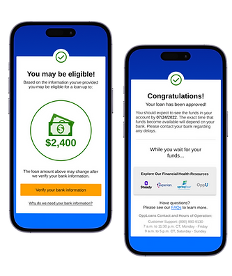.png)
Customer Portal Redesign
UX Designer - 2023
I redesigned our customer portal to streamline account management, creating an intuitive platform with user-controlled features and data visualization that empowers users to manage their financial journey more effectively.
🔍
+$1.54M in annualized recoveries during A/B test
🔍
-Decrease in customer servicing calls

.png)