
Customer Portal Redesign
.png)
Overview
🧙♀️ My role: UX Researcher & Designer
🗓️ Timeline: January 2022 - March, 2023
Challenge
Nearly all customer support calls (90%) were for basic account management that could be self-serviced.
The portal lacked visual loan tracking, offered minimal self-service options, and failed to encourage positive payment behavior.
Solution
Redesign the customer portal from a basic information display into an interactive, self-service platform with visual loan tracking, gamification elements, and comprehensive account management capabilities.
Key features
-
Loan Visualization Hub
-
Principal payment progress graph with refinance milestone indicator
-
On-time payment tracker with color-coded feedback
-
Self-Service Capabilities
-
Customer profile management
-
Settlement offer system
Impact
Quantitative:
-
Revenue: +$1.54M annualized increased recoveries through settlement system
-
Support: Reduced call volume for account management tasks
-
Efficiency: Streamlined settlement acceptance from multi-call process to self-service
Qualitative:
-
Restructured portal with intuitive navigation and clear user paths
-
Transformed complex financial data into accessible visualizations
-
Implemented layered information display for different user needs
-
Added contextual tooltips and alerts to increase financial literacy
-
Created modular design system supporting future feature expansion
User Research
Intern --> Full-time UX Designer
This case study represents a unique journey that spans my growth from UX design intern to full-time designer. What began as a theoretical redesign during my internship evolved into a multi-year project where I had the opportunity to implement and iterate on my initial concepts.
Some features have been successfully launched, while others represent strategic future improvements. This progression allowed me to witness how my early research and designs stood up to real-world implementation and how my understanding of user needs deepened with practical experience.
Problem Discovery
My first step was to examine the current portal and lay out the functions that were available to users. This portal was causing many pain points Oppfi and their customers. There were numerous shortcomings such as users not being able to update their contact information, not being able to see when a payment was pending vs. processed, and no visibility into loan health.
Original Portal
Portal functionality before redesign:
-
View loan summary
-
Make payment/view payment history
-
View current loan contract
-
Refinance (if eligible)
-
Upload documents
-
Refer a friend


Why isn't this working?
Now that I had an understanding of how the customer portal worked, I dove into some of the issues users and the business were facing.
I shadowed customer advocates who handle calls from customers, and dug through call recordings to document the reasons why customers were calling in.
Reasons customers were calling in

43% Payments
27% Loan Info
20% Personal Info
What does this mean?
On this pie chart, a total of 90% of the calls relate to self-service functions that should be available to the user in their customer portal.
Not only would adding these functions serve the customer and create a superb user experience, but it would also eliminate 90% of calls the customer advocates deal with. This would free up the lines for more complicated issues and allow the customer advocates to work to their full potential.
Brainstorm
Future Functionality
Now I could begin thinking about how an improved customer portal would function. I listed out all of the new functions I wanted to include to solve user pain points. I thought long and hard about the details that would need to be included in these functions and documented them.
.png)
Information Architecture
I built an information architecture for all portal functions to get a big picture view of the new portal. I was very intentional in the placement of certain functions to ensure the best user experience. I chose to have the ‘Profile’ and ‘Alert Center’ live adjacent to the menu because such a large portion of user pain points relate to these functions. I placed the ‘Payments’ feature and other action-oriented functions front and center since most users log into the portal to make or view scheduled payments.

⭐ During the initial phase of my full-time role, I partnered with a contract designer who refreshed the portal's visual design and established a modular framework.
As I continued in my role I was able to build on this new visual foundation, I designed several new features that directly addressed user pain points.
-
Loan Visualization Hub
-
Gamification Elements
-
Self-Service Enhancements
Modular Portal
Scrollable Prototype
1. Loan Visualization Hub
The Challenge
FullStory session replays showed users constantly trying to click on loan details that looked clickable but was creating false affordance. This confusing section was eating up prime homepage real estate while frustrating users.
Watching these sessions made it clear I needed to rethink how this information is presented, which led me to design a loan visualization hub.
.png)
Current Design
My Design
With the new modular foundation in place, I turned my attention to one of the biggest user pain points: loan information clarity.
I designed a comprehensive loan visualization hub, accessible from the homepage, that transformed static loan details into an engaging, interactive experience.
With this design I introduced new features such as:
-
Repayment Progress Visualization
-
Payment behavior
-
Progress benchmarks
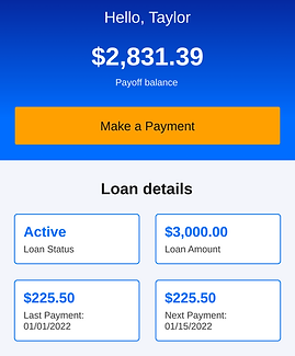
Loan Overview
Scrollable Prototype
Let's break down some of these features...
Repayment Progress Visualization
Challenge: Users lacked clear visualization of loan progress
Design Decisions:
The circular progress graph transforms complex loan data into an intuitive visual, directly addressing the 27% of support calls about loan information. The refinance milestone indicator encourages positive financial behavior, while the clear display of principal paid versus original amount helps users quickly understand their progress. The strategic payment prompt with financial education tip supports my goal of increasing user engagement and financial literacy.
Repayment Visualization

Progress Benchmarks
Challenge: Users needed motivation for consistent payments
Design Decisions:
The benchmark cards were strategically positioned above the repayment graph to create a clear visual hierarchy of progress. Each card serves as a milestone marker, with careful attention paid to the timing of their appearance to maintain engagement. The forward-looking design element – showing the next anticipated milestone – creates anticipation and motivation. This gamification approach transforms abstract payment data into tangible achievements encouraging repayment.
Starting benchmarks:
-
First payment
-
25%, 50%, 75%, principal paid
-
One more payment to go
-
Refinance eligible
Impact: Transforms loan repayment into engaging experience with clear goals
This approach leads the way for future gamification, recovery efforts, and marketing initiatives.
Click into the loan overview to see an example of a progress benchmark
👉
Loan Details
Challenge: 27% of calls were about basic loan information
Design Decisions:
The redesigned loan details consolidate critical information into a single, scannable card with a clear information hierarchy. I added tooltips to demystify loan status terminology, making them discoverable rather than intrusive. The design maintains visual consistency with other cards while using typography and spacing to distinguish different types of loan information.
Impact: Eliminated the dead clicks I was seeing in user sessions and introduced critical loan status information.
Future Consideration: Suggested integration with credit score tracking to help users understand relationship between loan status and credit health.
Payment Tracker

Loan Status Tooltip

Payment Behavior
Challenge: Users needed better insight into payment behavior
Design Decisions:
-
Created color-coded system for payment status
-
Green: On-time payment
-
Orange: Late
-
Red: Missed
-
-
Implemented dynamic messaging based on payment patterns
-
Added educational content about credit score impact
-
Designed alert system for missed payments
Impact: Provides clear feedback and motivation for payment behavior
Future Consideration: Proposed rewards system to recognize consistent payment behavior, such as reduced interest rates or cash back incentives. While not implemented due to business priorities, this groundwork supports future engagement initiatives.
Payment Tracker
2. Self-Service Enhancements
The Challenge
Next I turned to address another major pain point from my research: the high volume of support calls for basic account management.
I designed comprehensive self-service capabilities that empowered users to handle routine tasks independently. The settlement enrollment system and profile management features directly addressed the 41% of calls related to personal information updates and payment arrangements, transforming phone-dependent processes into streamlined digital experiences that users could complete on their own time.
Settlement Offer Designs
Challenge: Settlement acceptance required phone calls, creating friction in the recovery process.
Design Decisions:
-
Created clear acceptance flow directly in the portal
-
Simplified complex terms into digestible information
-
Designed clear confirmation steps to ensure user understanding
-
Made offers prominent for eligible users
Impact: During A/B test the flow generated +$1.54M in annualized recoveries (exceeding +$740K projection)
Future Consideration: Introduce a customizable payment plan, allowing users to propose their own settlement terms based on their financial situation.
Settlement Widget on Homepage

Profile Management
Challenge: 20% of support calls were for basic information updates
Design Decisions:
-
Built dedicated profile section in fixed navigation
-
Created intuitive editing flows for contact information
-
Designed scalable structure for future account settings
-
Implemented clear feedback for successful updates
Impact: Shifted routine updates from phone calls to self-service.
Future Consideration: Planned for expanded communication preferences including text notifications and customizable alerts for payment reminders.
Profile

Developer Handoff
⭐ As a one-woman design team, it's important to me to stay close to all aspects of a project's journey. I endeavor to create collaboration between various areas of the business to create a smooth transition from designs to the finished product.
For each of the projects in this case study, I followed my standard handoff procedures.
Responsive Design Approach
-
Created detailed designs for both mobile and desktop experiences, with priority given to mobile optimization (86% of users)
-
Provided responsive breakpoint specifications and behavior documentation
-
Ensured template components maintained design integrity across all screen sizes
Documentation & Assets
-
Created comprehensive design system documentation outlining component behavior
-
Provided annotated designs highlighting interactive elements and state changes
-
Developed a component library with reusable elements to ensure consistency
-
Included detailed specifications for animations and transitions
Stakeholder Collaboration
-
Presented final designs to cross-functional stakeholders including senior leadership, product, and engineering teams
-
Conducted walkthrough sessions explaining design rationale and user experience goals
-
Addressed technical feasibility questions and collaborated on implementation approaches
-
Aligned on success metrics and testing strategy
Implementation Support
-
Remained available throughout the development process for clarification and guidance
-
Participated in regular check-ins to review implementation progress
-
Provided feedback on development builds to ensure design fidelity
-
Collaborated with QA team to verify proper implementation of different user journeys
-
Created a feedback loop to document and address emerging technical challenges
Design-Development Partnership
-
Worked with developers to identify opportunities for component reusability
-
Collaborated on performance optimization without compromising user experience
-
Maintained open communication channels for real-time problem solving
-
Participated in code reviews from a UX perspective when appropriate
Conclusion
The Big Picture
This project represents my evolution from UX intern to full-time designer, demonstrating how theoretical research and designs transformed into impactful solutions. The most significant outcome was the settlement offer system, which exceeded financial projections by generating +$1.54M in annualized recoveries.
Key Learnings:
-
Research from my internship provided valuable foundation for full-time work
-
Balancing ideal solutions with business constraints led to pragmatic innovations
-
Iterative design process allowed for continuous improvement
-
Building scalable features ensured future growth potential
Through this journey, I:
-
Transformed complex financial information into engaging visual experiences
-
Created self-service features that reduced support calls
-
Designed gamification elements that encourage positive financial behavior
-
Built systems that can evolve with future business needs
More Projects
Application Redesign
UX Designer - 2024
I redesigned the post-application loan approval process, transforming an inconsistent experience into a streamlined journey through a flexible template system that builds trust and guides users through complex qualification scenarios.
🔍
+1.5% increase in company issuance
🔍
-15 minute reduction in completion time

.png)

